
Art Post : Sun and Moon (and how to draw Tim Blake Nelson)
- 18 mars 2025
- 10 min de lecture
Dernière mise à jour : 18 sept. 2025
Hollywood Undead - Paradise Lost


"We're the heart for the heartless The thoughts for the thoughtless
The lies for the honest
We're the gods of the godless
Let it all burn, I will burn first
God, I've tried, am I lost in your eyes?
Just let me burn, it's what I deserve
God, I've lied, am I lost in your eyes?"
It all started because people kept wondering how I felt about MCU Sam.
I don't know if it's because I'm a simp for Sam and a simp for Tim Blake Nelson so ultimatly the fusion of my two biggest obsessions would make the biggest obsession I ever had but this is the first time ever that another Sam is able to be at least as important in my heart as comics Sam is.
Probably also because I know everything there is to know about comics Sam and his variants while I'm merely learning to know MCU Sam. But he grew in me to the point that my heart can't choose between one or the other.
So I wanted to draw them together, I thought it would be the best possible answer to people who, for some reason, wish I would be disappointed in MCU Sam.
It started with a very ugly doodle. Couldn't drew MCU Sam's face properly so I just quickly doodled something (this one is, in fact, my 3rd attempt).

It's very hard for me to draw MCU Sam because I'm a big fan of Tim Blake Nelson and I perfectly recognize his face, so it's hard for me to like what I do. I need him to be as close as possible as Tim's face, I can't take too much liberty like I do with comics Sam. But the goal is to still keep my artstyle and so keeping freedom and it's hard to find a middle ground.
It took me 7 attemps to pull this one and feel somewhat satisfied. That's why I mostly draw chibi version of MCU Sam for now, because I don't need to respect Tim's face when I do so it's easier to feel satisfied :

I've been practicing his face for a whole month now, starting over and over.
Here're the few notes I took and applied to try to be as close as possible to Tim's face :

(he's so handsome and it upsets me a lot because I'm really trying to not behave like one of these crazy-ass horny fans online)
The first thing to get is his head shape. Hard to describe in my English but it's "thin" and kinda oval.
- He has a slightly recessed chin
- His nose is kind of triangle shaped from the front also but very round from profil, my fav to draw on him tbh, I like his nose, I think it's my fav feature on his face
- Very thin brows (almost invisible)
- Very thin lips, especially the upper one
- He has incredibly fucking hot dimples when he smiles
- Hollow eyes, I love that too, it's fun to draw and it's pretty
- Nasogenian folds also, not always very visible depending on the light but keep that in mind. I would recommand to not directly draw it (or very slightly) but rather add it through shadow because nosagenian folds are usually used to show strong emotions of drawings so it would look weird.
- Drooping eyelids, especially on the "outside" part of the eye (the part near the ear rather than the nose, basically) which I like a lot, it contrasts with the way I draw comics Sam's eyes and I like to make them "opposite parallels".

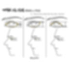
I recently found this tuto by taco1704 that I find relevant because it explains very well the difference when I draw MCU Sam's eyes and comics Sam eyes. Comics is the 2nd one, MCU the 3rd.
That's it for Tim. The only real tip I can give you is to draw something. It doesn't matter if it doesn't look like whatever you want to draw at all at first. Then put pictures of what you're trying to draw and observe both your art and the pictures. Check the differences, one detail at a time. Only one.
As I said, it took me 7 try because everytime I was correcting one thing at a time. That's how you spot and correct mistakes, you can't focus on everything all at once. You need ALL your focus on one thing to be efficient. First the eye shape, then size, then nose, then-- you get what I mean.
Now for Sam himself (still MCU) you gotta remember that his head is asymetrical.
The left part of his brain is slightly bigger (at least the kind of "brain bubbles" on it are), while the right part is way more difformed. His brainish part invading his neck and ear.

There's also dark green hair remaining here and there (I like that they still added this little detail on him, how his haircolor also changed).
As for his eyes, he has one left white blind eye and one right very bright neon green one. They both glow in the dark but the blind one's glow is way weaker than the other.

Unlike his comics self, I don't draw him smirking. He does smirk in the movie but it's barely visible (when he's on the phone with Captain America). His McFarlane smile near the end was more of a provocation than a real smirk. And I like that. Like I said, I enjoy giving him an opposed vibe. I want him to be very emo.
For his outfit he dresses all in black atm so it's not really complicated to either draw him like the movie or to come up with your own outfit. Very simple and very dark outfits.
I enjoy drawing him with his hood on (sometimes with sunglasses but I rather draw him without it because I'm literally OBSESSED with his eyes) and I personally give him a longer coat than the one we saw on the movie because of this removed shot (that was, I assume, before they changed his design, because of the shape of the hood) :

I love this shot so much, it's my very obvious obsession for figures in a very long coat with hood talking probably, but I just think it's awesome.
That being said, let's talk about these two drawings.
Even before MCU Sam, I always pictured Sam as the Sun. Because to me Bruce is a Moon in both his personality and how some of his mutations happened at night, very werewolf coded. And I wanted Sam to oppose him in every aspect (that's why I gave Sam very sharp trangle featured while Bruce is rounder/square, for exemple).
Sam is more of a Sun personality. Overly confident, talkative, egocentrical, full of energy basically (also his signature color is orange which is a warm sunny color while Bruce is purple, a night cold color).
It also matches very well his God complex.
My initial idea was to play with how comics Sam and MCU Sam oppose each others in their personality while still being similar in a lot of ways. So I kept the Sun/Moon allegory because MCU Sam's personality is, like comics Bruce, cold, quiet, sad, tired. A very "night" energy (and MCU Bruce has a Sun energy, as you know, that's the funny thing with their dynamic actually, comics Sam opposes comics Bruce, MCU Sam opposes MCU Bruce, comics Sam opposes MCU Sam, comics Bruce oppose MCU Bruce, giving me infinite ways to draw them). And he lives in the shadow, hidding from the light (he's kinda vampire coded tbh).
That's why they have the same composition with opposed mood and colors. One in white, the other in black, one is in the light, the other in the shadow etc...
I wanted to add flowers, like I often do, because flowers have so many shapes and form and meaning, you can just do everything with them. Flowers are life, in fact, without flowers there's no life. So adding them in my compositions is also a way to give more life to my creations.
I also wanted them to be somewhat "biblical", thus the Sun shape and the Moon looking like a church glasse, kinda. I guess it's because I grew up with Diablo but I really, really, deeply love the gothic biblical aesthetic of Hell vs Heaven, demons vs angels, especially when it's used to denounce it (having bad angels, good demons, that's kind of what Hulk is about, actually). Ironically, given my very vibrant and cartoony arts, I grew up with Baroque Art and Gothic Architecture (I'm French) and it's one of my biggest influence (mostly in the way I interpret anything Hulk I gues). It gives me a very sweet nostalgy of my childhood (and I'm also very emo). When I pull biggest piece it's more visible I guess.

I enjoy giving each characters I draw a flower. For comics Sam it's lilies, for gamma irradiated as a whole it's chrysanteum, for Human Sam it's sunflower (both comics and MCU) etc...
The reason I give lilies to Sam is very simple, I like them. People often call me "lily" for short, actually, because of Lirhya (My real name and nicknames aren't related to it AT ALL lol). I have a tattoo with Sam and lilies around him and I liked this composition so much that I started drawing him with these. It doesn't have any deep meaning.
Usually I would draw them black or purple because I see Sam as a fallen angel. But here I made them white to match the "light" of the whole composition.
The purple in the background is cold, opposing the general vibe to make the art more readable, as cluttered as it is.
I often draw comics Sam with purple as a lil' callback to his first color (he used to be purple while Bruce was orange haha) but also because Sam is nothing without Bruce and the purple is Bruce's signature color. In this context, it's also a way to put a little bit of MCU Sam in him, the same why I gave MCU Sam red, a warm color.
His pose means the same, similar but still opposing the other by facing another side, having his head slightly "down", smiling, while MCU Sam's head is slightly up, no smile, larger clothings etc...
Speaking of MCU Sam, I redrew the background twice. Because at first I gave him epiphyllums, for the reasons I talked about here :

(btw when I make that kind of random post it means I'm working and thinking a composition. I write down my own thoughts to properly process them, analyze them, find them back if I need to. That's something I would advice you to do, not necessarly online but on a notepad or whatever. Remember, composing is 90% thinking).
I ended up giving him anthurium because soon after finishing my lineart I noticed he was growing what seems to be anthurium in his prison. And the symbolism behind was so strong and hit me so hard that even if my lineart was done and I would have to redraw a huge part of it, I HAD TO draw them instead and connect them to MCU Sam forever.
"Anthurium symbolism : Happiness, Love, and Joy: The heart-shaped leaves of anthuriums represent love and joy. Their vibrant colors can brighten any room, spreading happiness wherever they are placed. Abundance and Positivity: Anthuriums are also symbols of abundance. Their lush appearance attracts positive vibes and good fortune."
For the record, that was my lineart before I changed it lol :

I also fixed a few things (his face too), as you can see. And I made the back slightly more elaborated with something similar to brambles because I thought the dark waves were waaaay too simplistic. Which is fine, simplicity is fine, I often do simplicity. But I wanted this art to look better than that. Because it was also my love letter to MCU Sam, my way to support him and Tim. My way to say how important he is to me, so I wanted to spend a bit more time on it.
I gave him crows because of the obvious Death allegory I mentionned above, because it suits his "shadow" energy very well and because in comics they say Death follows him. I also liked it because MCU Sam is, atm, a Sam Wilson antagonist and while Sam Wilson is now Captain America and we have a new Falcon, he's still a bird. So crows were very conveniant to me. Also because MCU Sam was always connected to bird but I'll go back to that in another post about the fallen angel/angel of death allegory so I'm not gonna explain that here haha.
Crows have white eyes to represent his blind eye, except the one on his shoulder. I also made it with open wings as a way to represent Sam spreading his own dark wings ("I make my own choices now" and all, it's just about Sam's freedom in the end).
I always represented Sam with dark wings anyway. Mostly because of Immortal Hulk in which Sam is represented as a God while Bruce is a demon. Because his writing is incredibly Lucifer-ious, because he's that fallen angel. And the fallen angel metaphor is equally strong through MCU Sam because it's about an innocent sunshine who damned himself because of his pursuit of knowledge. It's incredibly biblical.
And while Devil Hulk (a Hulk alter made after the Biblical Snake) isn't a thing in the MCU, I find it cool that the one who brought him that "apple" is Bruce. That's something I'll probably explore a lot in the future.
I kept the anthurium red, like the one he was cultivating, because like I said above it's warm, but also because of the very "blood" color and the way it's a very very good callback to his prison (the red light on him also).
That's also why I liked the idea of adding light blue of all cold colors. Because it's also an obvious callback to Mister Blue.
The green is here for obvious gamma reason. There's also green in comics Sam's compo, in fact, it appears yellowish because of the general ambiance and light but it's green.
You will also notice lil' circles with Sun or Moon in both. The reason is because in almost every of my comics Sam arts I hide The One Below All's eyes, as a way to illustrate how Sam is stuck in his cursed destiny and so it was my way to add that here too, I liked how with the Sun it kind of look like its howling big mouth and eyes. If you look back at my previous Sam arts, you'll see in a lot of them (not all of them, but a few) either two circles or eye shaped forms to represent The One Below All's eyes. Sometimes it's super obvious, sometimes it's more hidden :


I think that's pretty much all I had to say about these arts haha
I've been hesitant to do this kind of developped post about my stuff for a while because I just love when people guess about my intentions themself. Explaining your intentions prevent people from having their own feelings and interpretation about something and it's less interesting to me. But I did anyway because if it's less interesting for me I guess it's interesting for a few of you, to get to know how a little fellah think their arts. But do keep your own interpretations and keep sharing them with me prior to reading about my intentions, I truly love it 💚 Until next time, enjoy~