
Little Reac : The Art of Captain America Brave New World
- 4 déc. 2025
- 14 min de lecture
Dernière mise à jour : 23 avr.

I'm so so ecstatic right now you have no idea.
The reason I wanted Sam (Sterns) back in the MCU wasn't just to have him on screen, it's because I wanted to see a new story but mostly a new design for him. So when they announced a Captain America Brave New World artbook, it made me so happy and fuck, it didn't disappoint. I wasn't expecting so many Sam arts. Of course I got it day one, I wanted to make this post sooner but if you follow my BlueSky you know this Summer has been... Very complicated. Anyway, I'm super happy to dive in with you today !
Of course, I'll only focus about the Sam Sterns part because if I share this artbook it's mostly because I want to react to his design, for everything else you'll have to put your hand on it yourself.
This is a very interesting artbook because they did include parts of the first version of the movie and researches about it. You have Diamonback, for exemple. And so, for our boy we have a very large panel of design along with a part about a bigger Camp Echo One (confirming that it was meant to be a longer more important sequence, like I theorized a while back). And honestly I didn't think they would do that given the Backlash these reshots brought.
Interesting to see the Serpent Society was designed with techwear, proving that I was once again right when I said it was the perfect aesthetic for a Leader outfit lol.
Before we start, keep in mind that all these concept are 3D models or 2D arts, just because they look good here doesn't mean it would look nice on screen because arts modify light, color palette, it's static and it modifies body and facial structures so it always looks "better" than what you have on screen (I'm saying this for the "concept arts are always better" squad, please stfu and let us enjoy things). Also note that I didn't put alt text in most pictures because they're all pages of the artbook that I can't describe other than "a picture of the artbook". I "hid" them tho so it shouldn't disturb you if you use something to read pictures but it's hard to make a post that is based on what you see very accessible, I'm sorry about that, I tried but it wasn't interesting in a way or another.
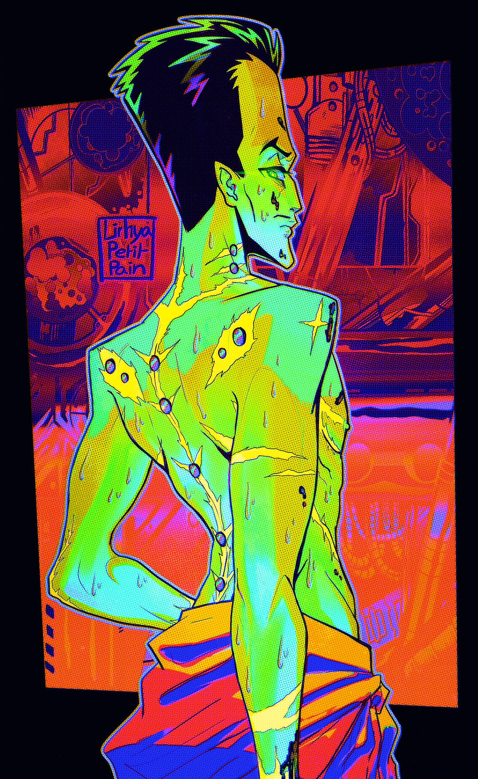
Alright, let's go, I'll go page per page but first of all I need to mention the cover art by Ian Joyner because Sam looks insanely good in it (and it's probably the only MCU Sam merch of his final look we'll ever get so we better take the time to appreciate it lol).

One of the thing I love the most about it are Sam's eyes. I often mention that but I absolutly what they did with them, it was a clever way to have both his green eyes and the famous McFarlane white ones and I love it, how it glows, I hope whatever the future hold for him, if he has one, they'll keep his eyes. His design will most likely evolve but I hope they keep the eyes, it's his best feature. Making his eyes dark with his pupils glowing like that makes him look so cool and cold in this art, I so love it. Maybe I'm just biased because it looks a lot like one of my most famous Sam fanart though.


It was so similar, specifically because of the ear shape, that at some point I even wondered if I inconsciously influenced Ian Joyner in a way or another. Not in a bragging way, but as a Sam fan and a Tim fan it would be the greatest honor to me and it would make me feel proud and while I think it's merely a coincidence because I'm kind of impossible to find through Google searches, that very specific ear shape make it a possibility. A small one, but a possibility nonetheless so lemme have my fun and artistical pride lol.
Beside, it did happen in the past already, that I influenced people who worked on that boy and who reached to me directly about it (maybe some of them read that blog, who know). It's a very comforting thought for me, in the way that everything I do is out of passion because I want my passion to live. The wonderful thing about passion is how immortal it is as long as someone cares and sadly there's not a lot of people caring that much about Sam out there. Tim doesn't need anyone for that, he's well known, loved and respected so I don't need to talk that much about him (I do it anyway because I enjoy that), but for Sam it's different. If I shut the fuck up about him then he goes to oblivion. There's so many people who met him through me and honestly it always surprises me because my online accounts are small, I don't have a big reach (I used to have a "bigger" one on X but still, 6500 followers is nothing and I rebooted my account since then anyway) and yet a lot of people know me. I've been mentionned to friends of mine IRL by people who didn't know they know me a few time, especially when Cap 4 came out and it's weird to me 'cause it's genuinely HARD to find anything about me when you look for Sam. Even if you look for fanarts, you'll find very old DeviantArt fanarts from people who drew him once because they enjoy drawing every Marvel characters. And I'm not saying this to complain, in fact I wish I could find more Sam fanarts. What I mean is I'm HARD to find nowaday ecause all my referenced posts are gone. So I'm in this in-between of having physical proof that people actually find me and know me when Sam is mentionned while wondering how the fuck is it even possible since I can't even find myself on searches lol. I never wanted to be famous, to have visibility and I still don't. But I'm craving it, I'm craving it because if I'm visible Sam is, it's not the other way, I don't use Sam to get popular, I use my very small visibility to give it to Sam lol. I discover so many things through other people's love and passion, I want people to discover Sam and sadly there's only me who make that possible right now. I was hoping Captain America would change that, I was hoping it would bring fans and it kinda did, I met people and for the first time ever I'm no longer the only one yapping and drawing about him. But they're shy and not nearly as present online as I am (and it's mostly on BlueSky anyway).
I remember someone once asking him "what if a bigger artist start drawing Sam and get know for it instead of you ?" and I said "bitch I wish". Everytime I mention how I wish someone else would draw or write Sam, I always have someone answering "why, you can do it yourself" and if I was an egocentric I guess it would be partially true, but I don't care about that. Don't get me wrong, I love my arts and I love the fanfictions I make up in my head all day long, but I want to see other people's vision of Sam, that's why I pay people to draw him for me, that's why I love earing Tim talks about him and that's why this artbook is important to me (you thought it wasn't about the artbook anymore, didn't you lol). Because as a fan that's what I want, I want Sam to be interpreted by other people, I want a fresh vision of him, not what I know, not what I think. I don't give a shit if I get popular, if my fanarts are the first things you find when you look for Sam. There's only one person in the World that I want to notice my fanarts anyway, not 6000, not 60 000, not 600 000, one and you already know who I'm talking about and how it's never happening lol, trust me, I tried, because as dumb as it might sound to you, there's nothing more important to me than Art, so of course I wanted the one who portrayed my everything to see what I do and how he inspires it. I didn't give up just yet though, one day I'll find a way to have him sign one of my fanart and it will be the best day of my whole fucking life haha. So speaking of Art and Sam and Tim, let's dive in the artbook itself :

First of all, excuse the poor yellowish quality of the pictures.
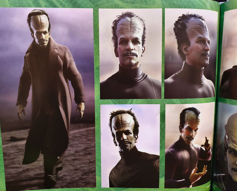
This first page shows the Sam we got and a concept of a very similar version with more hair.
I love the final one we got, I talked about it a lot already so I won't do it again but I think it was clever, they did make him look grotesque like his comics self and horrifying without having a ridiculous design. It's the most horrifying design we got (minus the Immortal Hulk one but I'll explain why it couldn't work later in this post) of all the concept they had, actually.
I like this concept with hair a lot. If the MCU accomplished anything, it's to make me love a mustache-less version of Sam, kuddo for that. This design looks like a "younger" Leader, because of the 3D effect, because of the big black eyes also. It's a scraped design but I like to think that's how he looked like prior to losing all his hair. You have his brain invading his neck like the final version also, except in our version his brain isn't just a brain texture, you have "bubbles" and stuff.

Here they started talking about Sam's comics history, I have nothing to say about that, it was pretty accurate and it makes me genuinely happy when people know they shit, research is the most important part of our job after all. I'm not fond of this design though, it doesn't look impacting or interesting, it's just, like, a random therapist design.

This one is very interesting, the second art goes super hard and you have a small print of it with the artbook (I didn't mention it but there's a few little prints with the artbook). It's interesting because it made the MCU comics Furry's big Week canon. In this one, S.H.I.E.L.D abducted Sam before its fall, not the army and they kept it in a tube to study him, so I assume it was following this idea.

Which has me wonder to what extend.
That 3rd concept art in the tube is also the closest thing you'll ever get of a naked Leader outside of my arts, granted we have a naked Sam in Immortal Hulk 34 but he's under his human form and his bush isn't somewhat visible like here so it doesn't count (yes I like bushes a lot, leave me alone, it's not even in a sexual way, I just think it's a nice detail of the human body that I like a lot on every genders).

These design are nice, I really like the idea of having some tech in Sam's forehead. That's something I do with his body in my own design, because I like the idea of Sam connecting tech directly to his body, it makes sense and I'm surprised nobody thought about it before these concepts honestly.
Having it on the forehead specifically is very good. I like both the little ones and the "crown", it's very nice, I have a preference for the little ones though but it's personal taste. I think both could have looked great and I would love it a lot if they do something like that with our actual MCU Sam if he ever comes back.
We can also notice how they really wanted to make his outfit casual (which I'm not a fan of) but I like this one more than the one we were meant to get, the long black coat with an orange turtle neck works perfectly here and it's a nice callback to Sam's colors and how he tends to hide his neck in comics. It's also very Leader-ish of him to have a long coat, for some reason it's totally something he would do even if it never happened. Something about the whole energy.

This one is my ultimate favorite because it's the closest thing I'll ever get to a live action version of how I draw him. The hair, the smirk, it's totally how I picture him. And all with Tim's face as a bonus ! This concept changed my brain chemestry forever.


These are haircut design, I don't have a lot to say about it but I kinda like how the first one looked like his Incredible Hulk haircut. It's not very Leader-ish tho so I'm glad they didn't keep it, I just like Tim's fluffy hair I guess...

This one has me think that we should never give Tim Blake Nelson thicker eyebrows. NEVER. He does look like a great Leader (the B&W concept is INSANE, in a good way) but idk, there's something very uncanny about it, it disturbs me a lot, I can't explain why lol because it's an objectively good design but it's just... I don't know, I can't.

How to make his brain apparent and bigger without having to grow his head. It's clever.

But this one is one of my fav because of how the brain invades his back. I think if we had a shot in the movie showing his brain on other part of his body, people would forgive the smaller head. It's a very original way to make his "big brain" mutation very visible. If Sam ever comes back I would love If they do that but unfortunatly Disney are led by a fucking coward and fascist book sucker who'd rather play safe and by play safe I mean listen to the loudest minority and their shitty-ass demands so they'll most likely go for the less cool first hobo look. But what you gotta understand is it's not Sam's head that is big, it's his brain. It often translates through his head because it's the easiest way to make it visible and obvious, but having his brain invading his body is another cool original way to do that.

Here again we have some "crown" design connected to his forehead. It's not that common in comics but that head accessory became somewhat of a "Leader thing", mostly because of the cover of Incredible Hulk 115 I assume. I'm not complaining 'cause it's something I like a lot though.
There's a lots of things with modern Sam that aren't common anymore, sadly, like his telekinesis power or his humanoids that I wish we would see more often and given the shape of these head piece I think they did attend to bring the telekinesis at some point, just like it's mentionned they thought about bringing humanoids. Both these things are, again, things I hope to see in the future.
This specific headpiece design is a bit too big imo and it clashes too much with the very casual design Sam still have here, I like the ones we saw above better. And yes the top one here looks like cat ears, you won't be able to unsee catboy Sam now.

This is a common headshape model, there's not much to say, though it's a good reference to draw Sam's head, it can be complicated to properly connect the cranium to the neck (even for me).

I like the first one a lot here, it's one of my fav Sam design they did. The brows and mustache are perfect, thin enough to match Tim while respecting Sam, it's very good. I don't like the one we have after though, it's too alienish and somewhat "ridiculous" looking.

This specific artwork goes insanely hard, I wish we could have prints of it. It's a very, very obvious H.R. Giger inspiration and as a huge fan of his work and alien I'm so in love with this piece. It has everything comics wise also, orange jumpsuit, retro yellow boots, gloves and belts. It's a modern version of the most common bronze age Sam design and mixed with this disturbing brain shaped alien cocoon it looks very good. This page is also how I found out there's a lunch box from 1978 that I don't own, which is an absolute sacrilege since I'm collecting everything Sam, as you know (I like the idea of having all his history and talk about it and stuff).
These one are way closer to the first scrapped design we almost got. I'm not into it, I explained why a few time. But I do like what he's doing with his hands here on the below right pic, it's a cool pose. But now that I think about MCU Sam's current personality, I'm not sure something like that would work on him anymore. Still very comics-ish so it's an enjoyable concept.

I know some people are like "the Leader should have looked like this" and I disagree, not for his first Leader appearence at least. It's a good science fiction design, but you need to bring it in a good science fiction setup to have it work, otherwise it would feel weird, in an "uncanny valley" kind of vibe. A good design need to be more than "comics accurate" (and once again, comics accuracy doesn't mean anything anyway), it needs more than "looking good", it needs to make sense to the story and whole aesthetic and it needs to serve that story. This design wouldn't work in a Cap 4 setup, I don't even think it would work in a MCU Hulk movie either. A design is nothing if it doesn't serve a purpose.
Don't get me wrong, I deeply love these design and ideas, especially the Leader-ish outfit we'll never get, but in the very specific context of Brave New World it would clash a little too much, it's better to keep that for another appearance (we're never getting any...).

I like the orange and black top on this one but that's it, everything else is too "startrek-ish", it's not what you want. It's, like I said above, too ridiculous for a live action, too "M.O.D.O.K situation".
After that we got a whole Camp Echo One segment :
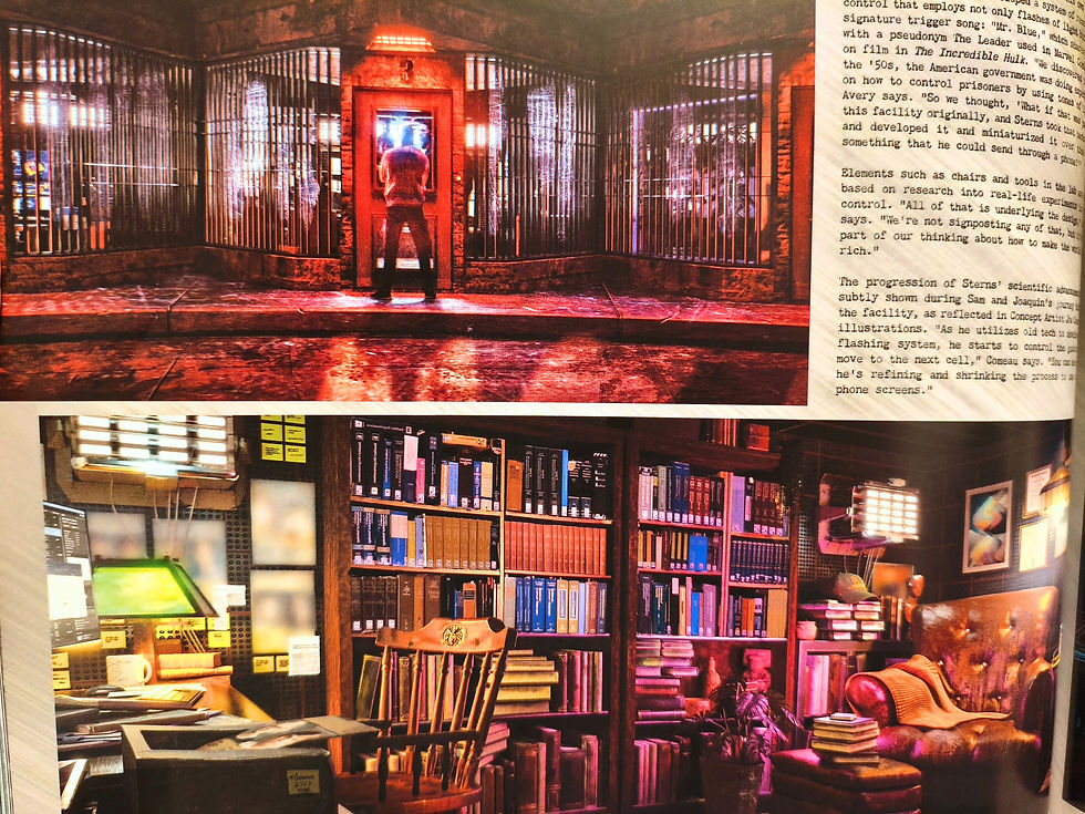


I like this concept, his head seems "more normal" and only green on the top, he's all bald and he's dressed like he was in the Incredible Hulk movie so I like to think it's a "younger" version of him in the work, like soon after he was abducted, before they poisoned him even more. I like to see it as a flash-back of some kind, even if I don't know the intention behind it. It's a thought that obsessed me since I saw the movie, Sam's life in his prison. Casual moments, hard moments. His life. I suppose they'd shave him and he would look like this even before his whole cranium mutated (which lust have been insanely painful also).


Through these concept and the little interview with it, you learn that Camp Echo One was supposed to be way bigger and a longer segment. You were supposed to see Sam's evolution into the Leader from a cell to another, seeing his technology becoming more and more sophisticated and stuff like that. It's an interesting idea that follow what they did, turning Sam's prison into a physical embodiment of his mind. His prison was a very interesting moment full of details that I wish would last more (or at least would be more important). Interesting also to note Captain wasn't with Falcon but with a woman, in one concept in his Cap outfit and the others the casual ones we got.
Alright, now we enter the Immortal Hulk Sam :


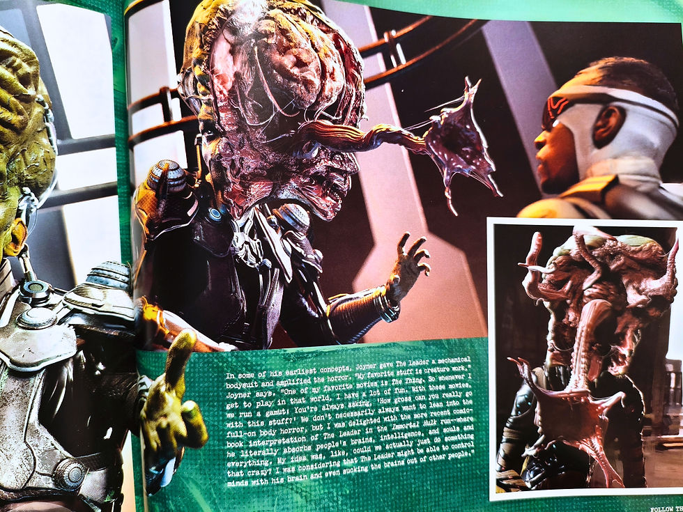
Ok first of all, that's not Tim Blake Nelson, that's Eric Zemmour. Second, I really don't like the idea of slapping the design of a nazi apologist who got fired by fucking MARVEL (the company who allows literal harassors, predators and pedophiles to work), because of his antisemitism, on a Jewish person. And honestly this Sam design does have antisemitic features and it's hard to believe it's a coincidence given his creator's history.
And third, it's impossible to make anyway because Tim asked for something practical and there's nothing in this design that doesn't require heavy CGI, it clashes too much with the whole aesthetic of the MCU and the MCU is kid friendly, which Immortal Hulk isn't.
The reason people like the Immortal Hulk design is because THEY LIKE IMMORTAL HULK. And it's funny because this design is nothing like the "comics accurate" one they yell about to shit on his MCU version. It's, again, a proof that comics accuracy doesn't mean shit. What matter is a good writing. All of these design could work with a good writing the way they won't with a bad one and once they work then they become "accurate", that's how it works. It looks objectively very good and I'm a fan of Immortal Hulk so of course I enjoy the work of the concept artist here. But I'm glad it's just a concept and nothing more.
That's all for this post. Overall I liked everything and everytime I didn't it was mostly because it wouldn't really match the movie, but it's an insanely good and interesting job they did here. Years ago I wouldn't even DARE hoping for an artbook featuring him and now he's on the cover of one ? Sure it ain't much given he has, like, zero merch and all because of his design change. But it's still more than I ever got and it makes me happy I'm here to see it myself. Passion is such a weird but powerful thing.
So until next time, enjoy~


Commentaires